
Red Axe Covers #9: Blessed Assurance
Maybe it's appropriate that this was the book that taught me to draw with my left hand – my 'wrong' hand. It’s said that you either use one side of your brain or the other when it comes to drawing, and I'm pretty sure this cover proved that point to me. For a designer it's really important not to close off too many creative avenues at the start of a project, and while I try my best to use traditional techniques in most of my covers, there's no denying the life-saving advantages of the final digital stages. In this case, it came to an actual reversal...

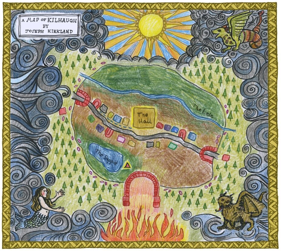
Joseph Kirkland's map of Kilhaugh lies at the centre of Blessed Assurance, and the biggest challenge in this commission was to create that map in the authentic style of an 11-year-old child. I became a reluctant faux-naïf. Whether or not I succeeded, I'm undecided. Picasso famously said that it took him four years to learn to paint like Raphael, but a lifetime to paint like a child. It's certainly not an easy thing to fake (in fact I almost asked my own kid to draw it for me. The trouble is he was the wrong age – and too good at drawing anyway).
I met up with the book's author Stewart Ennis for a chat and a pint in Glasgow's West End one sunny evening in the Spring of 2019. I had just finished reading the penultimate draft of Blessed Assurance and I was bursting to discuss the characters and themes of the novel with its author. Stewart told me I was the first person to have read the draft and he was pleased that I liked it so much. He had the giddiness of a soon-to-be-published author that says I'll be happy no matter what is on the cover. However, he did have some thoughts about what form the front of his book should take. He mentioned the artist Joan Eardley, and specifically her vibrant studies of Glasgow children. Stewart's characters are Scottish kids from a spectrum of backgrounds, and he saw Eardley's characterful style as a perfect fit. On the other hand I had William Blake in my head, for his queasy religiosity. The novel is earthy and grounded but with a spiritual aura around it. Joseph himself has an mystical undercurrent in him that occasionally comes to the surface. His inner struggle to come to terms with his family's religious expectations and his own inner demons was what I had to try somehow to get across.
I always saw a portrait of Joseph as central to the cover. It should be formal, carefully arranged, decorative; perhaps like a bookplate in one of those old book gifted to a youngster for perfect attendance at their Sunday School. Or he should be depicted surrounded by stars, or the rays of the sun, or some kind of religious symbolism. I began poring over images of Blake's watercolours and trying to absorb his style but I quickly reminded myself that it's one thing trying to ape someone's style, but a different matter to borrow their sensibility. I'm quite eclectic in terms of drawing but it's usually safer to stick with a style and technique that's my own. So, I decided to get my fingers dirty with a flickery, colourful pastel drawing.

The portrait took two or three days to complete. As is usually the case with a drawing, the first attempts were poor and frustrating. What you see in your head stubbornly refuses to appear on the page. When that happens it's best to leave it alone for a day, and move on to something else. So, returning to this scraggy pastel eventually, I tried to be simultaneously bold and looser and also to be more precise in the actual drawing of the details. What did Joseph look like anyway? Stewart told me he pictured him with a dark crop of hair – kind of curly perhaps. Again, a description vague enough to leave me with room for artistic license. I wanted his expression to be blank, but not vacant. It had to suggest his openness, with a slightly uplifted face. Looking to God? His glasses obscuring his eyes.
The artwork gradually took shape, and finally, in placing the image into the design itself dawned the realisation that maybe I had drawn him the wrong way around. In a notoriousl dangerous move I flipped the image. (This, as any art teacher will tell you, is how an artist reveals the flaws in his or her drawing. Look at it in the mirror and the disastrous lopsidedness or skewed proportions miraculously and disappointing reveal themselves.) As it turned out I hadn't accidentally taken on Picasso's cubist style, and mirror-image Joseph looked relatively correct. So then I tried him small, large, centred, to the left, to the right. Too many choices make themselves available to you when you go digital. In the end, I had him facing 'outwards' to the right, centred and large. He had to be dominant.
That Joseph ended up surrounded by a dense grey fog instead, with all the colour inside him struggling to get out, is due to the map. Joseph's Kilhaugh Mappa Mundi sucked all that colour and symbolism into itself, and took its place on the inside covers. Stewart had been determined to have his first novel feature a map of some kind at the front (because "all the best books have maps at the front"). In his pages the description of the map was detailed enough to help me populate the drawing but also vague enough to give me the headache of not really knowing where everything laid in relation to everything else. Which was probably ok because in a way that suited the naïve style of the map. I went through multiple drafts, trying to achieve that childlike style. My daughter suggested I draw with my left hand instead, which opened up a new definition of painful awkwardness for me. I'm aware that wrong-handedness is an art exercise but it's not one I'd choose to repeat very often. It was stressful – I could actually feel my brain resisting my hand. In the end I didn't really use the lefty drawings, they were just too rough. But the map was completed at last, then coloured in with scribbly coloured pencils, and decorated with monsters and mermaids around the edges. I figured that for these, Joseph would have referred to his old books and maps and found some original drawings that he could copy quite closely, so they would appear to be drawn in a more sophisticated style. The fog that cloaks the town during the passage of the novel is there too, pressing up against the village boundaries and hiding all the lurking terrors of the outside world – including the many gates to Hell that Joseph has been warned to avoid.

To extend the homespun feel of the cover I decided to create some hand-drawn typography. While it's one thing to try to remain old-school for technique, I needed the flexibility of digital editability with my titling. So I drew up my lettering on pastel again, with a faux three-dimensional aspect, scanned it, then began to compose them, settling on a framed arrangement, top and bottom on the page. A slender border around the portrait and a further border around the very edge the cover takes on a formal aspect which wasn't too far away from the religious iconography that I'd had in my head originally. The final elements were a pair of illuminations for the title: Grandpa's budgie in its cage, and the tinker's dog, looking almost wolf-like, caged by the woods. I tried to show them in a 'rampant' aspect, in the style of a medieval woodcut. It struck me that they formed a kind of symbolic symmetry that just fitted the themes of Blessed Assurance.
Mark Mechan (of Red Axe Design) is a designer of books and an illustrator. A Dundonian ex-pat living in Hamilton, he's been designing for over 30 years. To learn more about what he does, please visit his website.